
Operating System
Dull spreadsheets and static charts won’t impress stakeholders. These 10 creative financial data presentation techniques transform complex numbers into compelling visual stories that drive engagement and clarity—perfect for executives, investors, and data-driven teams.
Interactive Dashboard with Real-Time Updates

Picture this: an investor meeting where your audience doesn’t just see the data—they interact with it. Tools like Power BI or Tableau turn static spreadsheets into live, explorable dashboards where stakeholders drill down into metrics with a single click, uncovering insights in real time.
These platforms support real-time data feeds, so your dashboard updates automatically—no manual refreshes needed. Add custom filters (e.g., by quarter, region, or product line) and dynamic visuals like animated charts or heatmaps to highlight trends. For example, a stock performance dashboard could show live price fluctuations alongside historical context, all in one view.
This approach shines in pitch decks, board meetings, or investor updates where engagement matters most. No technical skills required—drag-and-drop builders make it accessible for non-coders. ✨
Infographic-Style Financial Reports
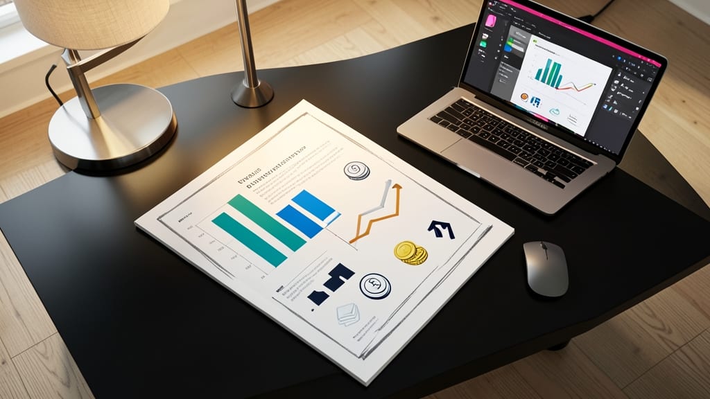
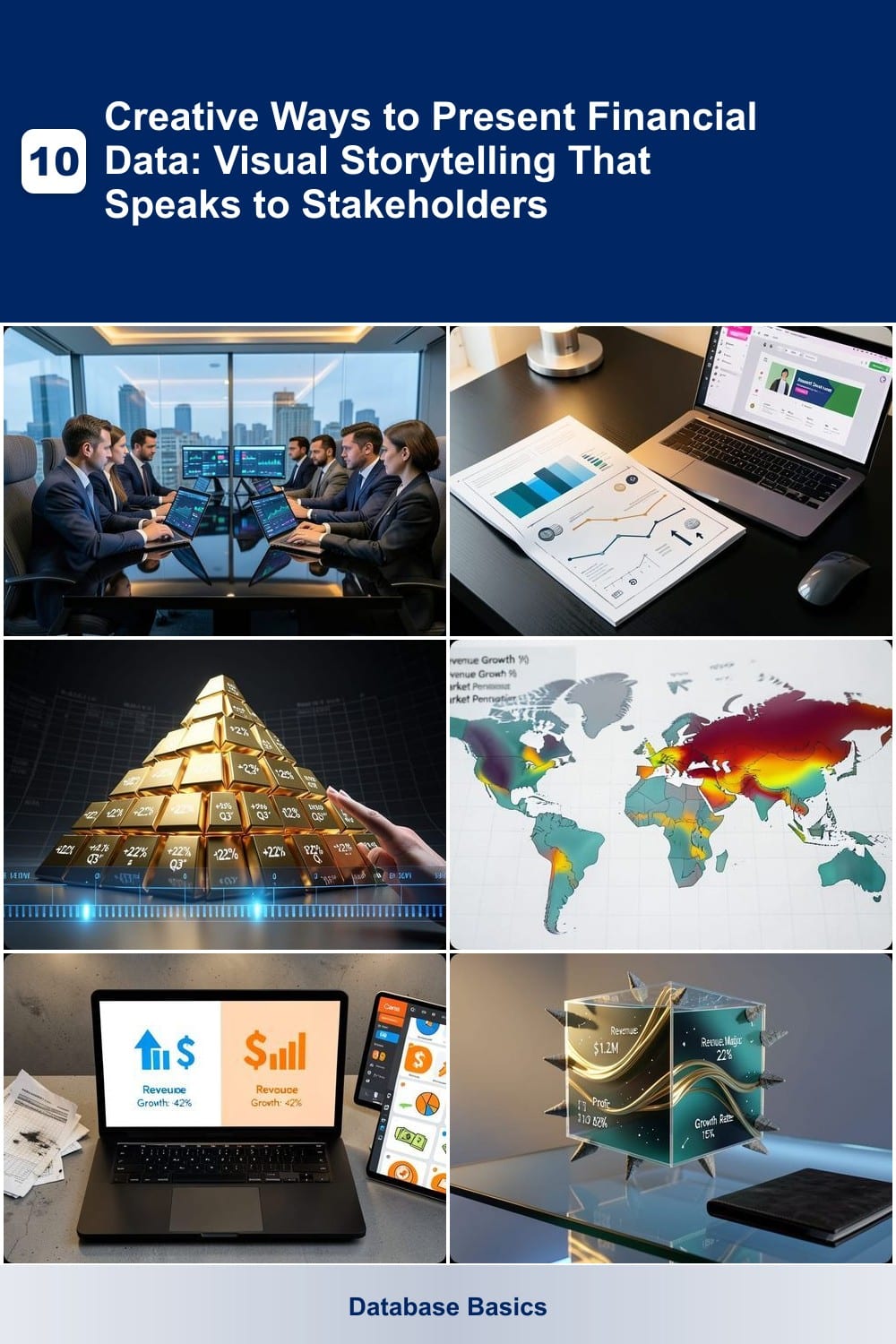
Tired of stakeholders glazing over dense spreadsheets? Infographic-style financial reports transform numbers into digestible visual stories—no PhD in finance required. Tools like Canva or Piktochart let you replace paragraphs of text with bold icons, color-coded trends, and minimalist layouts that highlight key metrics at a glance.
Start with a clear hierarchy: use large typography for headlines, icons (like dollar signs or growth arrows) for KPIs, and color gradients to show performance ranges (e.g., red for declines, green for gains). For example, a revenue infographic could map quarterly growth as a rising bar chart with supporting icons for expenses and profit margins—all in under 60 seconds to digest.
This approach shines for board meetings, investor pitches, or employee training where technical jargon gets in the way. Non-technical audiences retain insights faster when data feels like a story, not a chore. ✨
Animated Storytelling with Financial Data

Tired of stakeholders glazing over spreadsheets? Animated storytelling transforms dry financial data into a gripping narrative—think cinematic timelines where revenue growth unfolds like a blockbuster plot. Tools like Vyond or Canva’s Motion Graphics let you animate key metrics (e.g., a rising mountain for revenue spikes) with music, voiceovers, and smooth transitions.
Start with a pre-built financial animation template (e.g., "Business Growth" in Vyond) and sync it with your data. Add emotional triggers like celebratory confetti for milestones or dramatic pauses before critical declines. The result? A 1-2 minute video that sticks in memory longer than any PowerPoint slide.
Perfect for pitch decks, annual reports, or investor roadshows where you need to inspire confidence. Even non-designers can create polished animations in under an hour—no coding required. ✨
Geospatial Heatmaps for Regional Performance
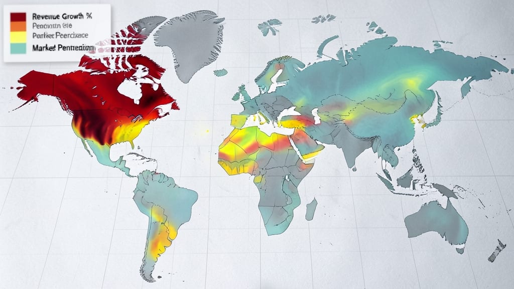
When regional performance drives your bottom line, geospatial heatmaps turn raw location data into actionable insights at a glance. Unlike traditional charts, these visualizations overlay color-coded intensity onto maps, instantly revealing high-performing areas, underperforming regions, and geographic patterns that spreadsheets miss.
Tools like Tableau’s geospatial mapping or Google Data Studio’s built-in heatmap layers let you layer metrics such as sales density, delivery efficiency, or foot traffic onto maps. The result? A real-time visual that helps retail teams spot store placement opportunities, real estate investors identify high-demand zones, or logistics managers optimize routes—all with zero coding required.
This approach shines for teams analyzing regional disparities—whether you’re comparing city-block sales data or global supply chain efficiency. For stakeholders who think in maps, heatmaps speak louder than tables. ✨
Comparative Data Visualization with Icons
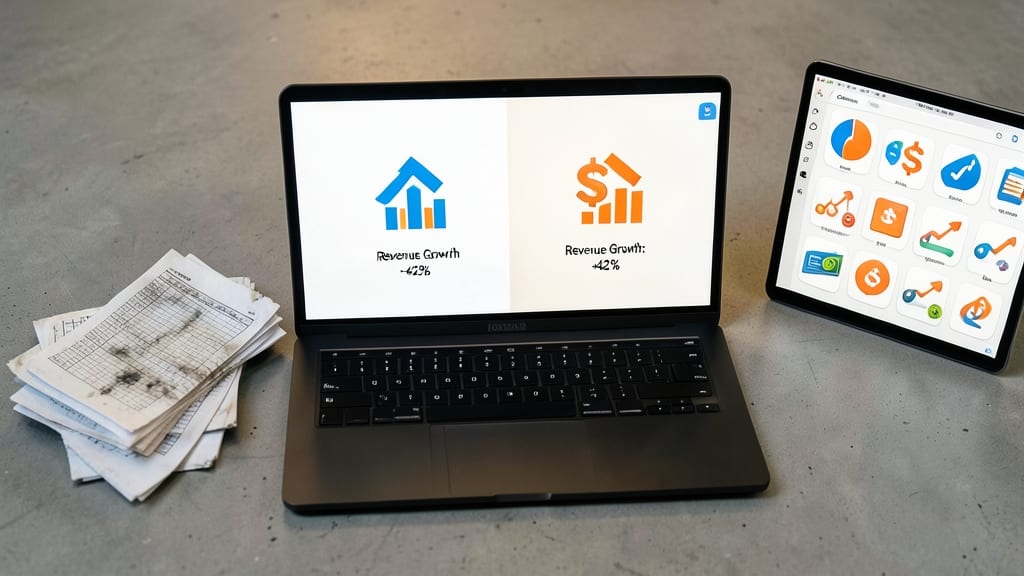
Tired of crunching numbers in spreadsheets that make your audience’s eyes glaze over? Comparative data visualization with icons turns dry financial comparisons into eye-catching, digestible snapshots—perfect for startups competing against rivals or teams tracking internal KPIs.
Tools like Canva’s icon libraries, Flourish’s comparative charts, or Venngage’s side-by-side templates let you replace columns of numbers with stacked dollar signs for revenue, growth arrows for YoY increases, or gear icons for efficiency metrics. The result? A one-glance understanding of how you stack up against competitors or internal benchmarks—no PhD in finance required.
Ideal for pitch decks, quarterly reviews, or investor updates, this approach works best when you pair minimal text with bold visuals. Start with free templates, then level up with custom illustrations for a polished, memorable presentation. ✨
3D Financial Models for Depth

When stakeholders need to feel the weight of financial projections—not just see them—3D financial models turn abstract numbers into tangible, interactive experiences. Unlike flat charts, these models let you rotate, zoom, and dissect layers of data (cash flow, ROI, risk factors) as if examining a physical prototype.
Tools like Siemens Lumion or Autodesk Fusion 360 (with financial data plugins) let you map metrics to 3D shapes—imagine a skyscraper’s rising floors representing revenue growth or a factory’s pulsing components highlighting operational costs. The depth helps stakeholders grasp capital-intensive timelines (e.g., construction phases) or supply chain dependencies in ways 2D graphs can’t.
Perfect for manufacturers pitching new plants or construction firms securing loans, where visualizing scale and risk upfront closes deals faster. 🌟
Story-Driven Financial Narratives in Video

Tired of stakeholders nodding politely through another dry PowerPoint? Story-driven financial videos turn numbers into narratives—blending smooth motion graphics with a compelling voiceover to make data feel personal and urgent.
Tools like Vyond or Animaker let you animate key metrics (e.g., revenue spikes as rising bar graphs) while a voiceover explains the why behind the numbers. Add cinematic transitions between slides—think zooming into a pie chart’s "profit slice"—to keep attention locked. For internal comms, this approach turns quarterly reports into bite-sized, shareable stories that stick.
Perfect for CFOs pitching to boards or startups selling vision—where data needs to feel human. No design skills? Use Canva’s video templates to start in minutes. ✨
Custom Financial Data Art

When your financial data needs to leave a lasting impression beyond spreadsheets, custom financial data art transforms numbers into stunning visual narratives. Tools like DataArt or D3.js let you map metrics to artistic styles—think Van Gogh’s swirling brushstrokes morphing into stock market trends or Mondrian’s geometric lines representing revenue growth.
The magic happens with algorithmic color mapping, where data points dictate hues and textures, creating pieces that feel both analytical and artistic. For example, a volatile market might render as chaotic, high-contrast strokes, while stable growth could emerge as smooth, warm gradients. These visuals work beautifully in creative agencies, design studios, or investor decks where memorability matters.
Ideal for brands with artistic flair, this approach ensures your data isn’t just seen—it’s felt. Perfect for startups pitching to design-savvy investors or teams that want to stand out in a sea of PowerPoint slides. ✨
Interactive Whiteboard Presentations

Turn passive presentations into dynamic brainstorming sessions with interactive whiteboard tools like Miro or Jamboard. These platforms let teams sketch financial models, annotate live data, and collaborate in real time—perfect for workshops where ideas evolve faster than slides can load.
Miro offers custom templates for financial frameworks (e.g., SWOT analysis or cash flow diagrams) while Jamboard’s touch-friendly interface works seamlessly with styluses or fingers. Both integrate with Google Drive and Slack, so you can save sketches as editable files or share them instantly. The magic happens when stakeholders participate—dragging numbers, connecting dots, and debating right on the board.
Ideal for agile teams or startups hosting investor workshops, this approach turns static data into a shared experience. No more one-way presentations—just collaborative problem-solving. ✨
Augmented Reality (AR) Financial Walkthroughs

Imagine walking through a retail store or factory floor while real-time financial data overlays your view—AR financial walkthroughs bring numbers to life by anchoring them in physical spaces. This isn’t just futuristic tech; platforms like Spatial or Microsoft HoloLens already make it accessible, blending spatial computing with financial analytics for immediate impact.
With AR overlays, you can visualize sales heatmaps on store layouts, cost breakdowns on manufacturing lines, or profit margins tied to specific equipment—all in real time. The zero-latency feedback lets stakeholders "see" the financial story unfold as they move through spaces, making abstract concepts like ROI or operational efficiency suddenly tangible.
Best for tech-forward industries like retail, manufacturing, or logistics, where physical spaces drive revenue. Early adopters report 30% faster decision-making when stakeholders interact with data in context. ✨